
Toothbrushes for all
Product design | Packaging design
Tafe SA
Toothbrushes for all was part passion project, part industry informed brief. The brief was to look into current and emerging industry trends, and develop graphic designs which responded to them. Whilst trends are ever changing and fastly moving, one trend that felt here to stay was inclusive packaging.
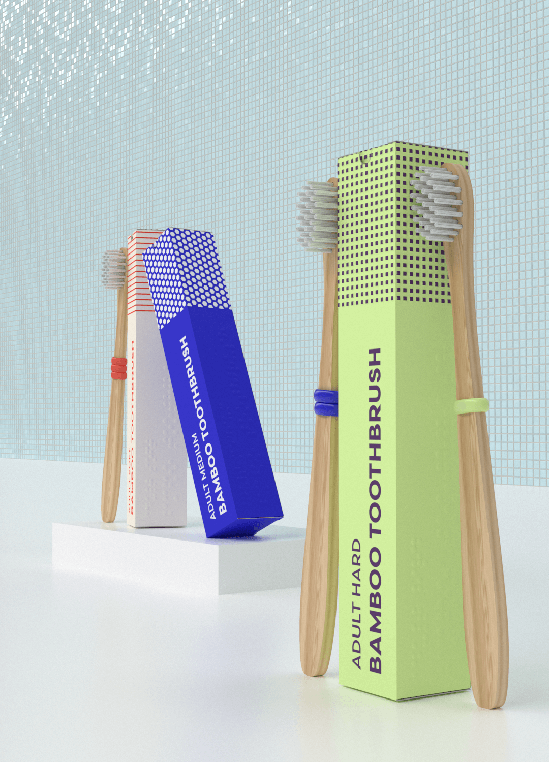
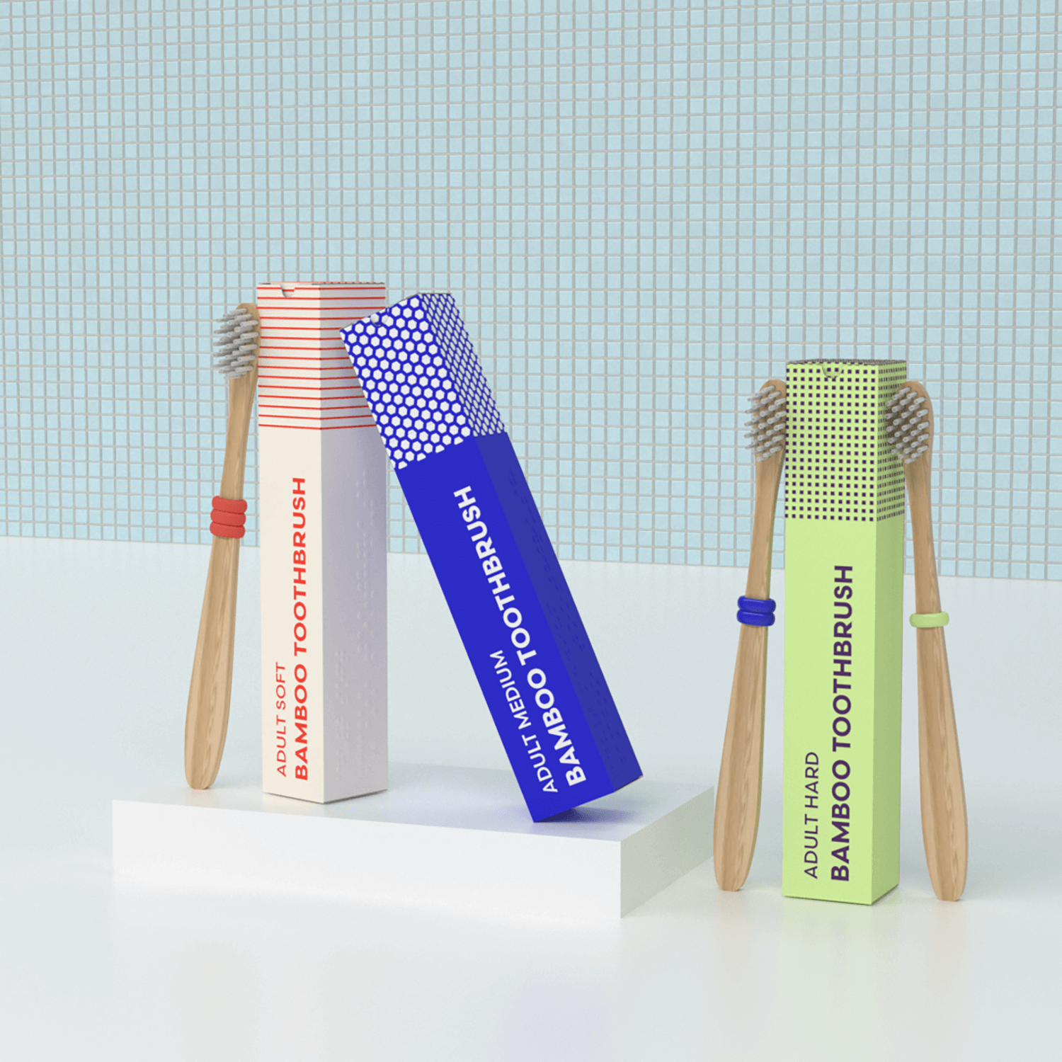
Inspired by this, I developed a set of toothbrushes which promoted inclusivity and ease of use. Toothbrushes for all uses braille technology and simple rubber rings as toothbrush identifiers. Whilst the brand is targeted at those with impaired vision, it’s friendliness and approachability encourages a broad market.
braille
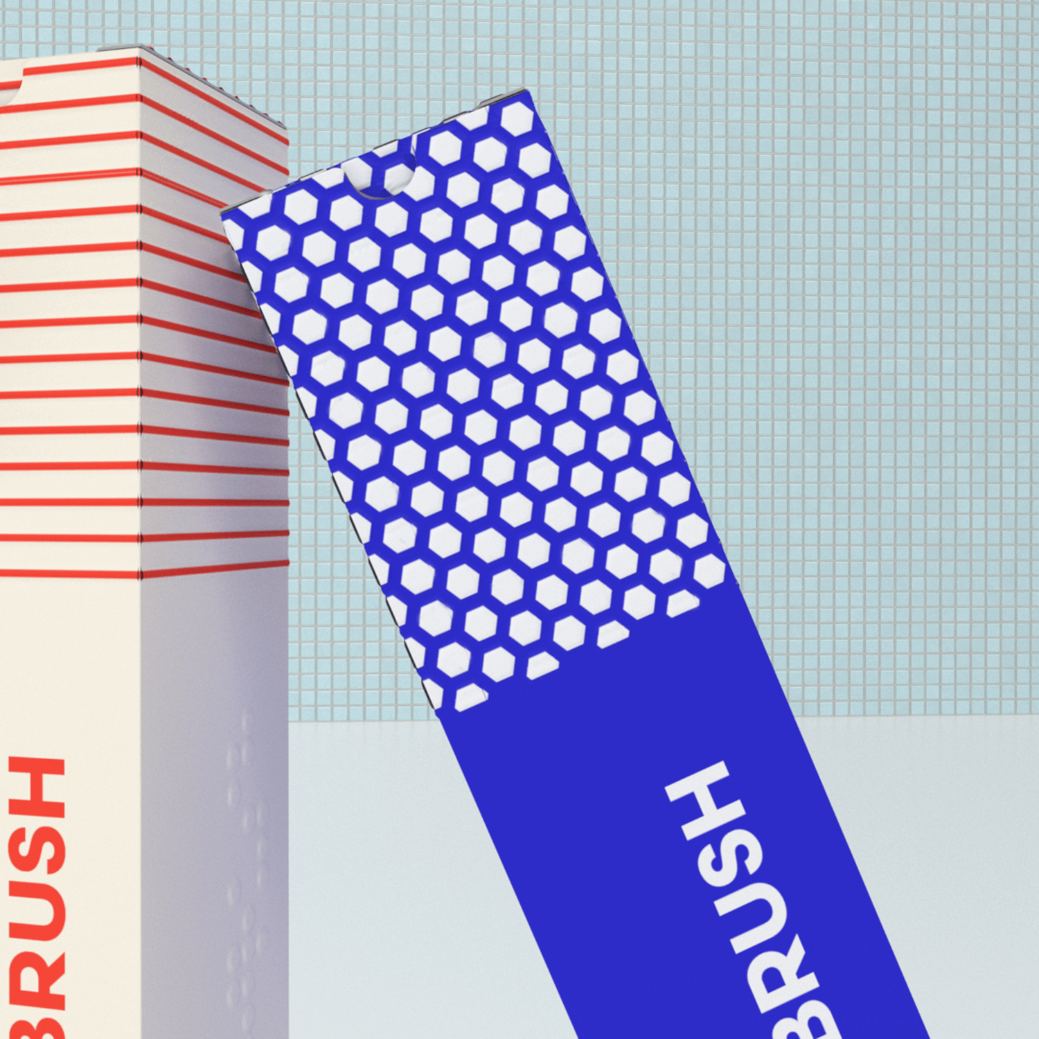
On each toothbrush packaging I used the corresponding braille – (e.g. bamboo toothbrush: adult hard) so it was easily identifiable on the supermarket shelf.
Alongside this, each box has a different raised pattern. These patterns were informed by research done by Parinda Sakdanaraseth where a visually impaired user was asked to describe how certain textured patterns made her feel. The three featured here corresponded to ‘calm’ (soft), ‘merry’ (medium) and ‘even’ (hard). Whilst this not only promotes a positive experience with the product for the user, it also builds trust in that the packaging is easily recognisable.